Here it is - you can't miss it.

This is not a critique, by the way; more of a meditation on my own subjective response to this building and the questions it provoked. Harmless stuff, be assured.
Externally, I like this building a lot, in fact I find it utterly delightful. I like its spiny, overgrown presence. It is like a bulging reptilian tumour. The building seems already to be spilling out of its site and it feels as though it might continue to grow over time, eventually consuming the top end of Swanston Street - not such a bad thing perhaps. I think this as I'm standing at the corner of Victoria Street - an intersection that has always had a sort of half-finished, motherless vibe which Lyons' building seems now to acknowledge and make acceptable. It even picks up colours from the surrounding buildings and sky, reflecting them back like a deformed mirror ball.


I'll come back to the exterior. I want to go inside because I had a different reaction to the interior. It's the interior that really got me thinking about this sort of freehand shape-making and questioning its nature and role in architecture.
The difference between inside and out is that once removed from the context of the street, this architecture of jagged forms becomes a world unto itself. To offer a fresh and liberating voice to the street is one thing, but when a designer's colourful vision consumes your whole world - as it does for the occupant of a large-floor plan building like this, the difference between liberation and oppression may come down to the degree of sympathy a given occupant has for the architect's aesthetic. My own initial reaction was to feel just a little bit pestered. Now I fully realise that this is subjective, but like any person who wants to feel right about his feelings (which is a complicated way to feel, I'll admit), I began searching for an objective explanation.


Unsure of whether I am reacting to the underlying character of this building or simply the loudness of its delivery, I thought I'd address these one at a time, beginning with the building's character.
There are moments and spaces here that I actually did enjoy - that seem to hint at what this building wants to say to me. I start to think about and list the sorts of ideas and emotions these variegated, angular spaces seem to evoke: discord, excitement, complexity, unpredictability, irreverence, rebellion, relativism, motion, change, possibility, novelty, disregard for tradition, the rejection of rules and assumptions... In this way it is easy to imagine how these spaces could feel exciting and energising - not a bad way to feel really. Apart from 'novelty', which perhaps hints at superficiality, the qualities I've listed seem to describe a positive viewpoint and an essential aspect of growth and development - whether in an individual or a society.
There are moments and spaces here that I actually did enjoy - that seem to hint at what this building wants to say to me. I start to think about and list the sorts of ideas and emotions these variegated, angular spaces seem to evoke: discord, excitement, complexity, unpredictability, irreverence, rebellion, relativism, motion, change, possibility, novelty, disregard for tradition, the rejection of rules and assumptions... In this way it is easy to imagine how these spaces could feel exciting and energising - not a bad way to feel really. Apart from 'novelty', which perhaps hints at superficiality, the qualities I've listed seem to describe a positive viewpoint and an essential aspect of growth and development - whether in an individual or a society.
Additionally, I can't help but feel that these qualities and the character they describe are an aspect of something more general - that perhaps they are a feature of some sort of contemporary zeitgeist. I realise zeitgeist is an old-fashioned and unpopular idea nowadays, but is hard to deny that certain ideas and attitudes run strongly through a culture at any given time, however complex and varied the whole picture might be. A word that I think captures many of the qualities listed above is 'individuation' - the emphasis on relativism and individual choice and expression. I think that commercial advertising is one of the best indicators of a fully-developed zeitgeist, and it seems to me that a plethora of slogans such as 'Because it's MY choice' or 'A credit card that suits MY life' want to engage with this spirit of rebellion and personal destiny, if in a depressingly banal way.

In this age of commercialised education, advertising for universities often adopts a similar sort of language. On a billboard at Richmond Station, a current RMIT ad features an image of criss-crossing railway tracks accompanied by the slogan 'I'm taking my own path'. In the SAB building, the idea that students are the masters of their own education is even built into the architecture, with lecture theatres featuring chairs that swivel around so that students can face - and learn from - each other, rather than just the lecturer. Personally I hated group work when I was at uni. Just couldn't stand it. I always felt that I would rather learn from somebody who knows their subject, like a teacher, than from students who are as clueless as I am. I know I sound like a grandpa, and that top-down education is just the sort of antique practice this architecture is decrying, but I'm a bit of a conservative in that regard. Perhaps that's why I am relatively quick to reach saturation point when it comes to this sort of jagged, harsh-coloured design - it feels like too much confidence in the latest thing. In the context of education I suppose the message to be read in these spiky, non-orthogonal forms is something like 'Untether yourself from convention - think outside the box'. It's a fine enough message, but it's also good to remember that people have been innovating for hundreds of thousands of years without the benefit of jazzy angles and "interactive multimodel learning spaces".
Well this might not be a critique, but it is starting to sound like a rant - and one whose conclusion offers me little comfort: that perhaps I am just emotionally out-of-synch with contemporary trends. That said, I do very much like the building's exterior, and I also like some of the 'portal' spaces - the student spaces that offer expansive double height views to the outside world. In these spaces I can enjoy the contrast between the building's irregular forms and the rectilinear ones that populate the city's rational nineteenth-century grid. Perhaps my ability to enjoy this architecture is dependant on its being contrasted with a bigger picture, and that contrast's mitigating effect on the architecture's brashness.

Setting aside the question of my own degree of affinity for the jagged forms and oblique angles that dominate these spaces (and that dominate much contemporary architecture), my first assumption was that, for an interior space, the architecture was simply too loud, or too forceful in its delivery. This is, after all, a place where students are expected to develop their critical faculties and perhaps produce an original thought or two of their own. Is there a limit to how much of its own personality a building should thrust upon its occupant?


Lyons are not the first architects to make me ponder this question, in fact I sometimes think about this in relation to Frank Lloyd Wright. Wright's houses are an example of 'gesamtkunstwerk', literally 'total art work'. Just about every interior detail and furnishing is built seamlessly into the architecture and is faithfully subordinate to a single and idiosyncratic aesthetic vision. If you attempt to bring your own furniture, curtains, floor rugs, lamps or other decorative trinkets into a Frank Lloyd Wright house, there's a good chance they'll look ridiculous. The thing is, a lot of people - even more today than a hundred years ago - would cut off limbs to live in one of Frank's houses, in fact I think I could stand to live in one myself. But you know the bargain you are making in doing so - you are willing to sacrifice a small portion of your own self-expression in exchange for the reward of living inside the world of Wright's extraordinary imagination.

I wonder if Wright's secret is in the deft and harmonious execution of his ideas or whether there is a taste factor involved as well. The Meyer May House pictured above is an example of Wright's early and very influential 'Prairie Style'. The Randall Fawcett House, below, completed more than 50 years later, is in a completely different architectural idiom. In both of these houses, Wright's unique vision is delivered at full volume, but I suspect that, today, fans of the Prairie Style's woody, arts and crafts feel might find the Randall Fawcett House, great though it is, a bit harder to live with, or would need to acquire a taste for space-age exotica to fully enjoy it. It strikes me that we are likely to feel the force of an architect's hand the further the architect's vision deviates from our own.

The opposite end of this spectrum might best represented by Ludwig Mies van der Rohe's S.R. Crown Hall (1956) on the campus of the Illinois Institute of Technology. (You could also visit Toorak library - Melbourne's own homage to Crown Hall.) With its uninterrupted, column-free interior, Crown Hall is meant to be an exemplar of what Mies called 'universal space'. The spacial planning is one thing, and interesting from a functional perspective, but Mies saw the character of his architecture as being just as universal - happily applying exactly the same architectural language to offices, homes and even religious buildings. Simple and apparently rational, this kind of high-modernism was purportedly free of any kind of cultural or personal bias.
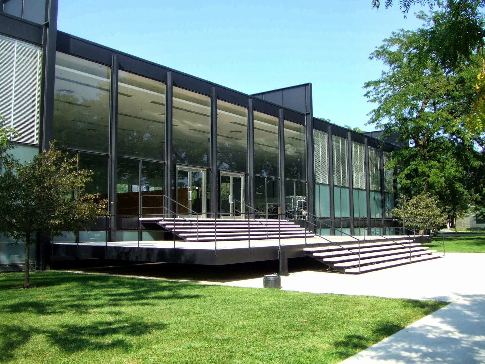

Today, many people feel a renewed attraction to this sort of architecture while some don't. It could be (and has been) accused of seeming bland, homogeneous and culturally sanitised, but it isn't likely to put anyone off their breakfast. At its best, on the other hand, this architecture is meant to offer its occupant something like a blank canvass. The occupant might feel as though they were living in an agreeable, well-proportioned template - the details of the story still to be elaborated. Conversely, in a Frank Lloyd Wright house, or the new SAB building, one runs the risk of feeling a bit like a character in a story that someone else has already written. Then again, even modernism has a story to tell.
Perhaps all of this raises more questions than it answers. Is it architecture's job to inspire us with a particular vision of the world? Should that vision be generalised enough to express something on behalf of a wider culture? Should it be expressed lightly enough that there is room for the observer or occupant to project something of themselves into the picture? Does Mies van der Rohe's modernism promote individual freedom or does it promote the idea that we are all the same? Is he treading lightly, or treading just as heavily as Lyons but with a different message? I'm not sure what conclusion to draw from the above, and I'm certainly not suggesting that impersonal functionalism is the right approach to architecture.
One thing that occurred to me when I was thinking about Frank Lloyd Wright has to do with the relationship between ornamental form-making and geometry. By 'ornament', I'm not just talking about surface decoration. In the sense I am intending, any form or space becomes more ornamental the further it is distanced from the recognisable necessities and facts of a building - enclosure, function, structure and so on.
It seems to me that in the work of Frank Lloyd Wright, the use of geometric logic as an ordering principle has a powerful effect on the way in which the more arbitrary (or ornamental) elements of his design are perceived. Looking at the Robie House, ornament begins firstly as an elaboration or symbolic representation of the building's structural elements - such as the way the timber ceiling trim appears to follow a structural grid linking the solid piers between the windows. (Never mind that most of the structural work is actually being done by steel beams that are hidden out of sight, it's the perception of order that's important.) It is when the design elements become more expressly decorative that the logic of geometry takes over. Have a look at the window glazing. There can be no practical explanation for these stained glass windows, and the design itself is forcefully idiosyncratic - recognisably Wright. But a design like this will evoke some basic level of agreement even from a viewer to whom Wright's sensibilities - and the time and place to which they relate - are completely alien. As I see it, Wright's idiosyncratic vision is propped up by the universalising effect of geometric harmony.


In contrast to this, the geometry of the SAB building is deliberately not harmonious. Externally there is, in fact, a certain formal order, owing both to the repetitious surface pattern and to the uniformly amoebic floor plate (which gives the building the pleasing appearance of having risen out of a vertical extrusion mould), but any geometric order governing the interior spaces is much more elusive. The spaces may be judiciously planned, but the effect is intentionally chaotic. Harmony is not the goal here, and that is fair enough; this is the geometry of disagreement - of young, curious minds butting against each other. This is entirely valid of course, but it means that if a building like this is making a statement and someone happens not to agree with that statement, there is no universalising balm - no recourse to the absolute - to smooth the dialogue.


Of course it could be argued that the experience of irrationality and disorder is no less universal than that of order, in fact it is rather more commonplace (if I wish to engage with disorder, even in a wealthy, urbanised environment like central Melbourne, I don't need to visit the SAB building), but notwithstanding physicists' increasingly untidy picture of our universe, is chaos universally appealing? A quick survey of civilisation's artistic ambitions across history would give the impression that the pursuit of order or harmony (a word which shouldn't imply 'simple and serene'; harmony can just as often be complicated and restless) has been a rather fundamental aspect of aesthetics. The romantic 'Smash it up' aesthetic seems to be limited to periodic bouts of artistic cleansing - the exception rather than the rule. Disorder generates excitement, especially when life has become a bit routine or oppressive, but does the appeal of disorder itself transcend time and culture in the same way that, for example, harmonic proportions do? Is 'Smash it up' where we are up to in history at the moment? There does seem to be a touch of epistemological anarchy in some contemporary architecture - 'What, after all, is a ceiling? Who can say?' Is a building like the SAB a valid way of dealing with the moral and philosophical skepticism that have characterised much of the post-modern era, or is it symptomatic?
In any case, if a building's 'ornamental' aspect is guided neither by the functional and structural realities of the building, nor by any kind of formal harmony, it must find other ways to convince the non-believer of its cause. As one example, an abstract form can evoke a certain kind of energy, attitude or emotional state - much like an abstract expressionist painting. I think the SAB building does this powerfully, as previously discussed; my issue being that the suggested mood or attitude seems rather forcefully delivered (at least in the building's interior) and might not resonate with all of its users.
Another way for an abstract form to communicate is through what architectural writer Charles Jencks calls the 'enigmatic signifier'. Jencks has adopted the term 'enigmatic signifier' to refer to the phenomenon of a building whose form suggests certain meanings or metaphors - usually allowing multiple interpretations - while not definitely referring to anything in particular. Jencks described the phenomenon in relation to a nascent postmodernism in architecture, pointing out its role in allowing a building to be read in multiple ways by different people and taste-cultures. He wrote that metaphors create drama, and that if they are vague and multiple, they create mystery: "They float around in our mind to pick up connections where they can, like a luxuriant dream following too much cheese and wine." More recently when writing about iconic buildings of the early noughties, Jencks has hinted at the enigmatic signifier being something of a weakness - an architectural crutch symptomatic of an era that has no strong beliefs and little idea of what it wants or where it is going.
I think Jencks is right on both counts, but in its defence, the enigmatic signifier is, for me, the one thing that makes a crazy-shape building more enjoyable than, well, just a crazy shape.
Here is a new building in the Docklands that I am referring to as 'the gash building'. It was designed by Woods Bagot for NAB. Apart from the little white triangles (enough triangles, architects!). I like this building. In terms of the enigmatic signifier, my mind dashes back and forth between gaping knife wounds and some sort of geological catastrophe. I like the image of this black glass modernist behemoth that has met with unspecified apocalyptic violence.

Similarly, I think the reason I enjoy the exterior of the SAB building so much is (apart from the enjoyably disruptive way it relates to its urban context) because of the vague metaphors it arouses - the reptilian tumour thing. There is something vaguely Ghostbusters about it. Once inside the building however, I lose this sense of it and as with other crazy-angled buildings, there are only so many cave images my mind can produce. Notice that at the NAB 'gash' building, the loud colours and craggy clefts are kept outside; the material/colour palette of the interior, with its fantastic atrium (below), is a bit more sotto voce. I think there's something to be said for that; as a parent might request of noisy children, 'Use your inside voice.'

Again, there are spaces inside the SAB building that I can enjoy, and in some cases the difference between the spaces I do and don't enjoy comes down to some fairly superficial details. Colour is one example. I can't help but feel that a warmer colour palette makes an interior space feel cozy and inside-ish - particularly valuable in spaces that have less access to natural light. Hence, I'm happy with the red, and the occasional introduction of stained timber or plywood helps too. What I struggle with is this assaulting green that seems to pop up regularly in certain types of contemporary architecture. Is it just me? I once heard Howard Raggatt of ARM (who have used a similar colour across the road) listing the various intellectual imperatives for using this green in spite of the unpleasant visceral reaction it can cause. I like ARM, but I remember thinking, really? Is this the conversation we're having?

The other thing is lighting. We all know that fluorescent lighting is, as the phrase so easily goes, 'good for the environment', but unless it is carefully used, it can be quite bad for any environment that it is actually illuminating. One traditional approach to fluorescent lighting is to aim for a sort of artificial daylight effect - an 'omnilucence', if you like. This is how heaven and mid-century offices are lit. You can see how in the example below, an illuminated ceiling grid is used to achieve a puristically uniform spread of light. This is very much in the spirit of Mies van der Rohe - universal lighting for universal space. Whatever you might think of the Miesian approach, the worst thing you can do with fluorescent light is to surround it with dark surfaces, house it in a black shade and mount it at 2.1 metres above the floor, producing an eye-torturing contrast between bloodless light and shadow. My phone camera has a deceptively mitigating effect on this.

One thing I do really like about the SAB building is the spacial planning - the informality, the ambiguity between circulation and occupation spaces (which are yet easy to navigate), the variety of general-use student spaces accommodating a mix of small nooks and more open spaces, and of course the dedicated double-height student portal spaces with views across the city. Any student would feel welcome, lavishly accommodated and respected here.


This is one of the 'portal' spaces that I quite like. One contributor to this is, again, the double-height windows that offer a view to the world beyond. Here, the erratic forms are back in context - a lively retort to the simplicity and predictability of conventional spaces, and - I'm guessing at a potential metaphor - the simplicity and naïvety of outmoded principles and ideas (for which the shear wall of brutalist concrete blockwork across the road volunteers as the perfect symbol). The restless whimsy of the ceiling and other irregular forms is further counterbalanced by the warmth and familiarity of brickwork - introduced by the nineteenth-century building next door and carried through the space as a floor finish. Finally, the classic anonymity of black steelwork ties the whole composition together.
This space has a sense of ease, even restfulness about it despite all that is going on. The warm material palette, the higher ceiling and the lack of eye-level fluorescent lighting give the space a humanising quality, and the youthful exuberance of the architecture is allowed to speak with reference to a wider view of reality.
It is in spaces where the more novel and (perceptually) arbitrary elements of the design are allowed to dominate without counterpoint or context, that I start to get that slightly worrying feeling of having come loose from any kind of foundation - cultural, logical or otherwise. It is a slightly alienating feeling. It is not the architectural form that I find alienating, it is the attitude that this kind of free-form shape-making sometimes evokes for me - a spirited but over-confident repudiation of all rules and beliefs, a rejection of the possibility of anything objective or absolute. There is of course pleasure to be had in the surprise of unexpected and discordant forms and spaces, but I'm not getting any of the the long-range, existentially soothing quality that I personally look for in architecture. I can't help but wonder whether, when the novelty wears off, the lack of deference for the passage of time, for the long story, will catch up with us.
But the future isn't here yet, and for now at least, I think this sort of thing is pretty cool:
No comments:
Post a Comment